03
System Concept Map
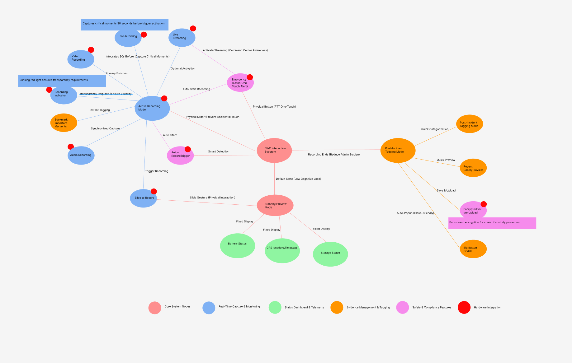
BWC Interaction System — Full Feature Map · Colour-coded by function cluster
Core System Nodes
Real-Time Capture
Status & Telemetry
Hardware Integration
An Android-based system prototype optimized for 3.2-inch displays. By integrating physical hardware controls (PTT, recording sliders) with digital operations, this design enables one-touch emergency broadcasting, covert recording, and privacy modes — balancing high-stress field performance with evidence integrity.
A specialized mobile system designed to streamline evidence collection and officer safety through multiple operational modes: Emergency & Live Streaming, Dynamic Recording (Standard / Covert), Privacy Management, Data & Storage Tools, and System Utilities.
Research indicated significant "administrative bloat" — the burden of tagging footage could deter proactive policing. Solution: a "Safety-First, Accountability-Second" framework. The UI prioritizes immediate physical safety and effortless recording over administrative tasks.
Frontline emergency responders operating in high-stress, unpredictable environments. They need: operational reliability (trigger critical actions without looking), situational awareness (critical status over secondary info), and regulatory transparency (automated recording and metadata logging).
UX/UI & Interaction Designer. Responsible for design research, typography system, terminology conventions, core interactive modules (Emergency, Recording, Notification, Settings), and specialized visual accessibility for small-form-factor displays.
Investigated socio-technical factors of body-worn cameras. Research revealed significant "administrative bloat" — footage tagging burden could deter proactive policing. The flat information hierarchy emerged: critical telemetry (battery, storage, recording status) anchored to fixed positions for "one-look" verification.
"Safety-First, Accountability-Second." The UI must prioritize immediate physical safety and effortless recording — not administrative tasks. Every screen element was evaluated against this hierarchy.
To solve the 3.2-inch (360×640 px) constraint, the design integrates software responses with physical hardware inputs. Critical actions (recording start, emergency alert) mapped to physical slide gesture and dedicated SOS button — reliability even when the officer cannot look at the screen. The EMG state automatically initiates a live broadcast.
Physical buttons take precedence over touch UI. The software confirms, not initiates. Digital feedback validates hardware actions — never the reverse.
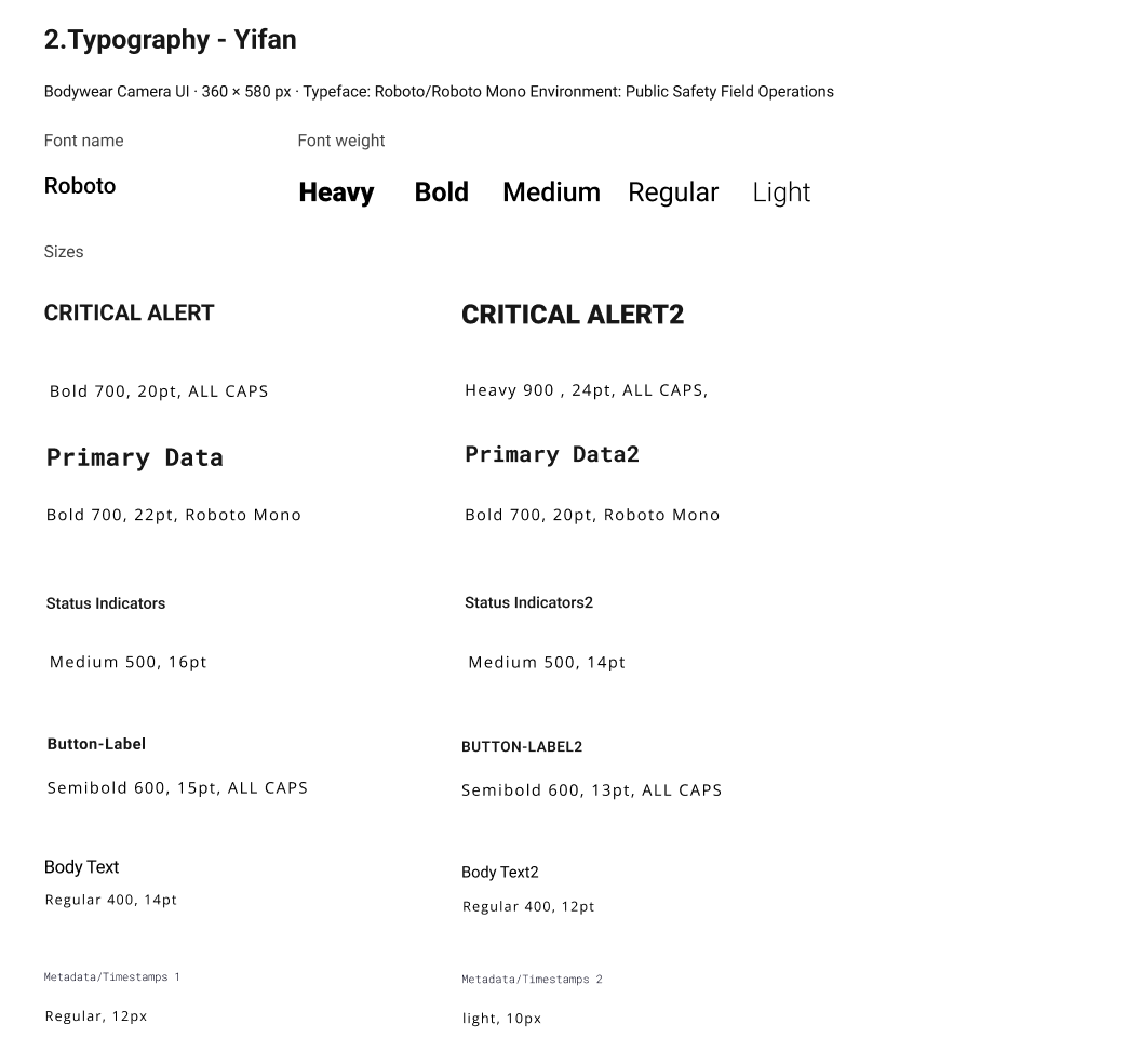
Spearheaded the Typography system within the Style Guide. Typeface: Roboto / Roboto Mono. Optimized font weights for legibility at 229 ppi. Established strict Labeling Convention: all-caps action labels, abbreviated system states (EMG, REC, STD), maximum two words per button to minimize reading time in field operations.
Designed core UI modules: Emergency & Recording (hardware triggers with real-time digital feedback), Notification System (system alerts keeping officers informed), and System Settings (streamlined Wi-Fi, battery, physical button configuration). The annotated Motorola device mockups document every design decision.
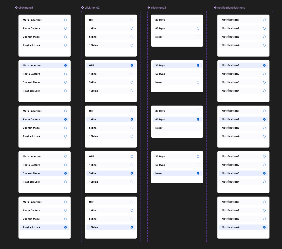
Simple menus reduce decision time. Save/Cancel buttons stay at a consistent location for predictable interaction. No cognitive surprise in high-stress moments.
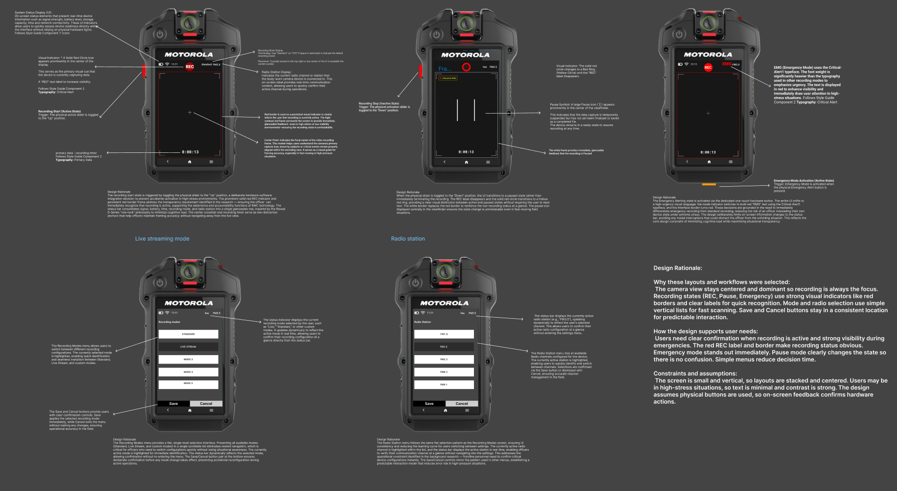
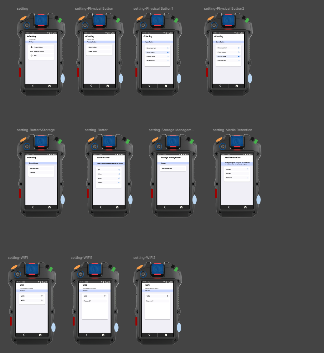
Critical telemetry (battery, storage, recording status) anchored to fixed positions, allowing one-look verification without scrolling. Secondary functions accessible but never competing for visual priority.
REC = solid red circle + red border. EMG = critical alert typography, red overlay. Pause = white frame. Each system state has a distinct, unambiguous visual signature — no reliance on text alone.
Inspired by the Hytera VM780: implemented a Large-Target Grid UI for post-incident tagging. Replacing standard lists with oversized touch targets functional even with gloves — accessibility is a safety requirement here.
Strict naming convention (EMG, REC, STD, Live) ensures instant recognition under cognitive overload. Always "SAVE," never "CONFIRM" or "APPLY." Consistency across 360px is not stylistic — it is operationally critical.
The process highlighted the critical need for "subtractive design" when working with extreme constraints. Initially focused on feature richness, task analysis revealed that a frontline responder's cognitive load is too high for complex touch interactions during emergencies. The prototype's success lies in treating software as an extension of the hardware — immediate, clear feedback for every physical trigger.
Consistency is a safety requirement, not a style choice. In a restricted 360px width, there is no room for ambiguity — the strict labeling convention (EMG, REC, STD) ensures instant recognition. Function over aesthetics: designing for public safety taught me to anchor every decision to the "Safety-First, Accountability-Second" framework — minimizing cognitive load rather than visual decoration.